Advertising
| X360 Friday, July 7, 2006 | 8:41 AM

Characters and screenshots of Project Sylpheed

Characters and screenshots of Project Sylpheed

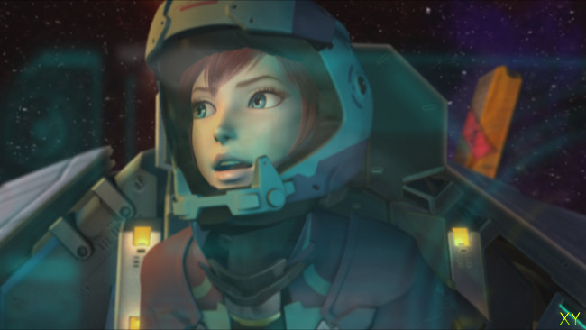
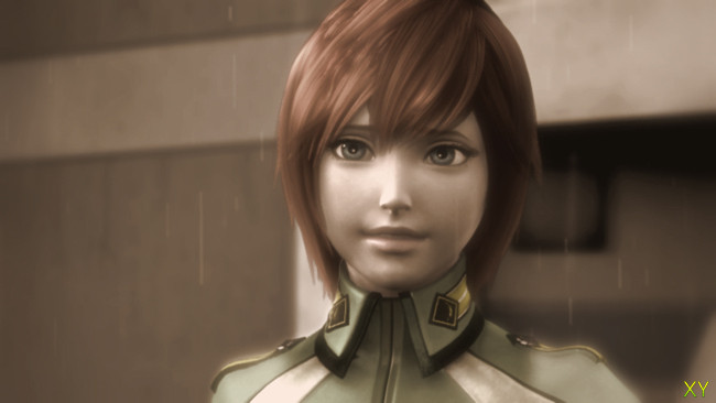
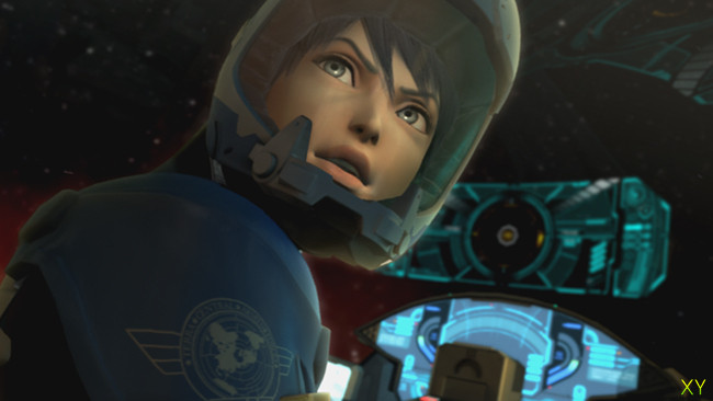
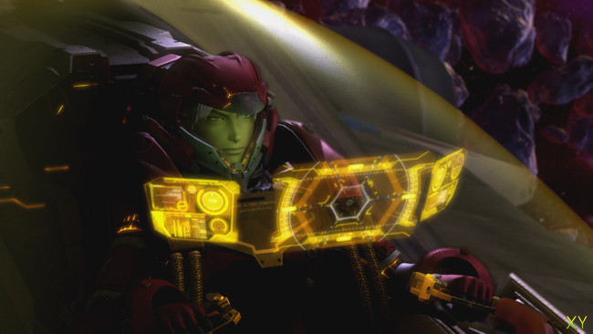
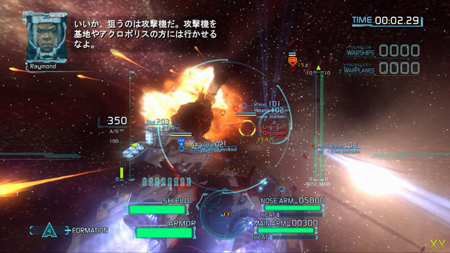
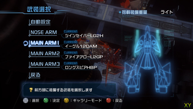
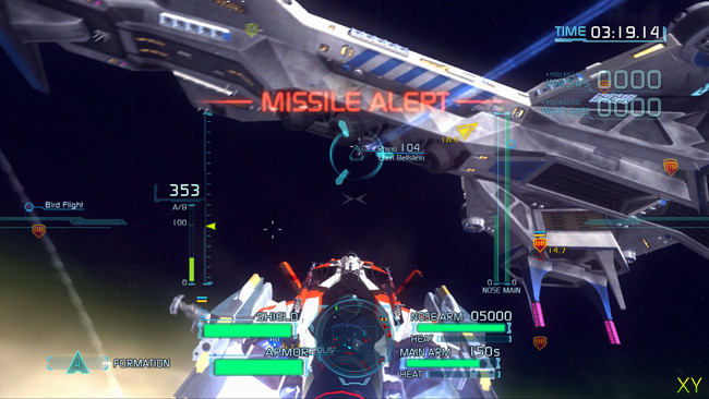
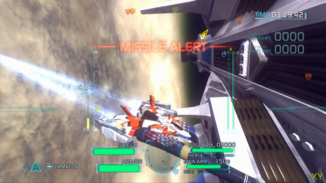
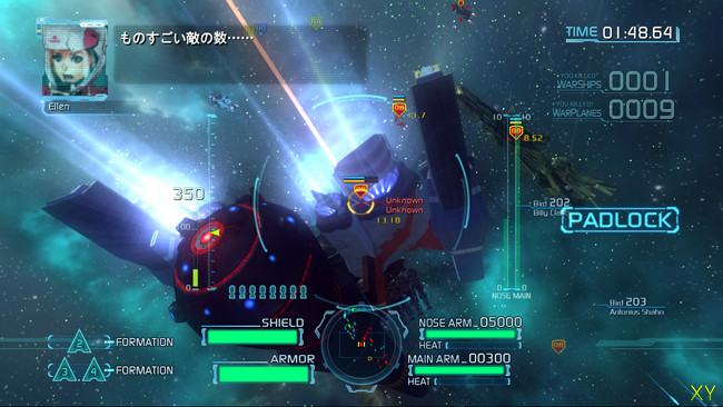
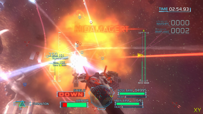
The official japanese site of Project Sylpheed is now up and running. It's yet another flash site, though it's quite nicely done, but I've still extracted the images to keep everything simpler. Enjoy these shots of the 3 main characters Ellen, Katana and Margras, and these 6 ingame images.


All comments

Commented on 2006-07-07 09:58:32
Beautiful. They remind me a lot of Xenosaga’s characters.
Commented on 2006-07-07 09:58:50
Pretty cool, but I can't wait to see some videos of this one. The graphics are acceptable, but I want to see the gameplay.
Commented on 2006-07-07 10:06:22
looks cute, reminds me of x-wing - dunno why
Commented on 2006-07-07 10:36:58
wow, sweet stuff.. now bring movies of the gameplay and lets see if we get a beautifull space shooter as this promise. Looking quite stunning as far as these screens go!
Commented on 2006-07-07 11:03:30
I think its cool that square enix is making this game for 360.. Although just because its a square enix game doent mean that it will be awesome.. These screenshots are not very impressive.. I remember FF in PS2 ..while summoning a monster there was a mixture of realtime graphics and some sort of full motion video if I'm right which made the game look fantastic but still it was a trick.. So looking at these pictures now i'm not very impressed..The same goes with the characters.This is a shoot em up game so how will we see them realtime? You already see a graphics difference between the characters inside and outside the spaceship.. We'll have to wait and see a video.
Commented on 2006-07-07 11:45:47
So beautiful, I cait wait for the game.. The music is so beautiful. I think it will turn out good..
Commented on 2006-07-07 12:18:42
Star Fox 360, it looks good but not great, however it's an awesome developer so I hope this will turn out good.

It's impressive how many japanese games are coming, the list is endless: over g, Chrome Hounds, Lost Planet, Dead Rising, Project Sylpheed, Enchanted Arms, Bullet Witch,Kengo, Namco Rpg, and a long etc. It's so strange to see xbox recieving so much japanese love, but keep them coming :)
Commented on 2006-07-07 12:50:41
Too much HUD on the screen. Really detracts from the game.
Commented on 2006-07-07 13:11:17
The cgi is beautiful the rest? the in-game?
Its okay...
Commented on 2006-07-07 13:25:33
I duno why people keep assuming this game is by Square-Enix, it's by Game Arts.

I duno how closely they are working together on this or whether SE are just publishing it.

Art style looks good, I'm hoping this is on rails in all honesty, similar to Panzer Dragoon, i'm not a fan of space sim style fighters.

I'm hoping you get to fight on planets aswell as in space.
Commented on 2006-07-07 14:57:45
^I think there both working on it.. and both have in put..

plus I can tell ppl that think 360 is crap that, Square don't think so.. I may of already have 2 or 3 ppl getting a 360 now..XD

Because there blind, they think 360 crap, and they think PS3 will win no matter what.. I loved PS2 and PS1 but Sony is lost it with this crap there pulling..

Anyway, I think both have some work in it.. IF Oh well, I sold 2- or 3 360.. So its wroth it..XD
Commented on 2006-07-07 15:33:08
People will probably buy the game just to watch the CGI-cutscenes.
Commented on 2006-07-07 17:10:48
graphics aren't everything :P
Commented on 2006-07-07 18:34:08
Posted by Rottie
Too much HUD on the screen. Really detracts from the game.
Totally agree with this, they need to re organize all that shield information , it's blocking the view of your ship. Also their is way to much text on screen in a few of those pictures.... it's annoying and hopefully it's changed or you have the option to remove it
Commented on 2006-07-07 20:54:08
For some reason, the characters look similar to those from Enchant Arm to me..especially the guy in screenshot 8, Margras.

The trailer looked good, i'm just not into space shooters though :\
Commented on 2006-07-07 23:15:39
Posted by Brandino
Totally agree with this, they need to re organize all that shield information , it's blocking the view of your ship. Also their is way to much text on screen in a few of those pictures.... it's annoying and hopefully it's changed or you have the option to remove it
Well I think the HUD fits perfectly for the atmosphere of the game.
Commented on 2006-07-09 19:36:23
those are pretty good

About the game


Advertising
What's up?
  • Megido
    Megido Maybe he was hitting on Liam's daughter and now he knows whats comin'. (4 minutes ago)
  • blmbox
    blmbox Seriously, the amount of times I shouted out "HOLY SHIT!" during the movie was endless. Brilliant action. (4 minutes ago)
  • Phaethon360
    Phaethon360 <<< Jack Black is like "WTF" at the What's up box. (9 minutes ago)
  • Megido
    Megido yeah, cause if you do you'll get electric screwdrivers in your legs and a fist full of pain no matter what. Laked and haning handcuffed from the sealing he'lls till beat your ass to a pulp. (9 minutes ago)
  • Phaethon360
    Phaethon360 Taken was awesome. I'm more afraid of Liam Nieson with just his hands than when he has a lightsaber or is a lion. Dangerous man. Don't date his daughter! (11 minutes ago)
  • blmbox
    blmbox Apparently the torture scene was cut from the version shown in cinemas? (48 minutes ago)
  • TheBeagle
    TheBeagle @blmbox: yeah, its excellent (57 minutes ago)
PreviousNext
Top stories