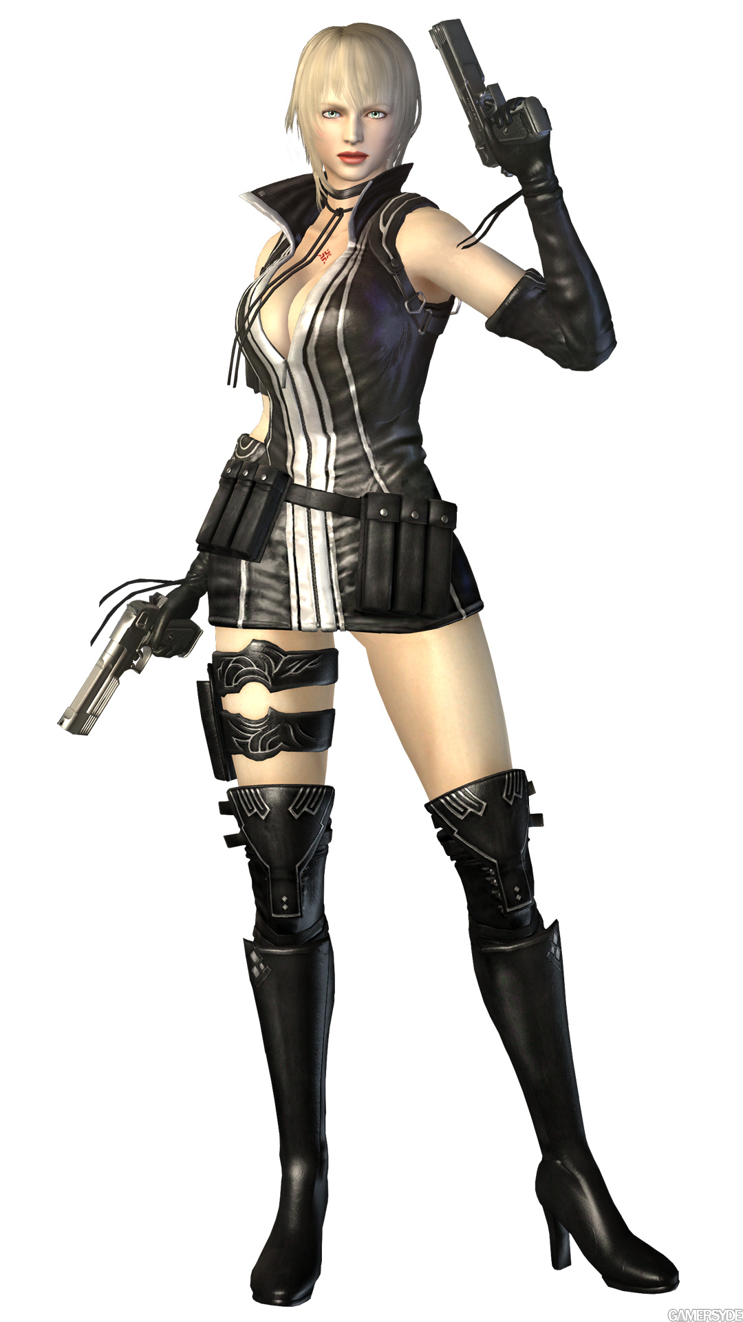
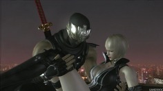
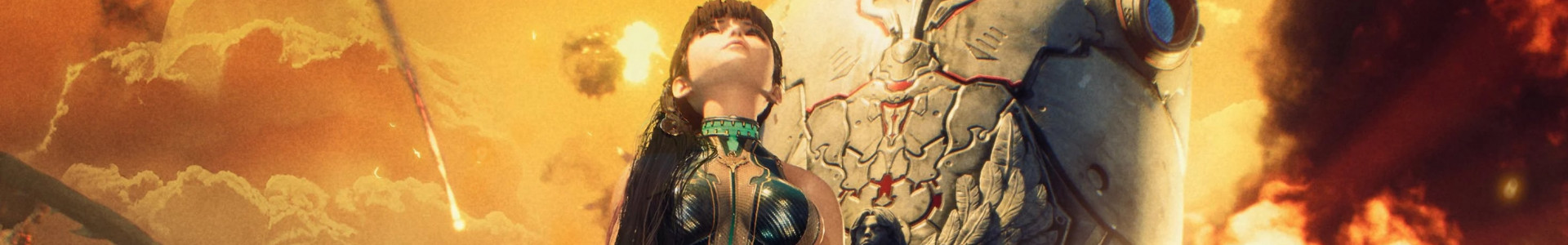
Microsoft and Team Ninja released these 2 artworks and a cutscene video of Ninja Gaiden 2, unveiling Ryu's new female friend called Sonia. No doubt, this is a Team Ninja game!
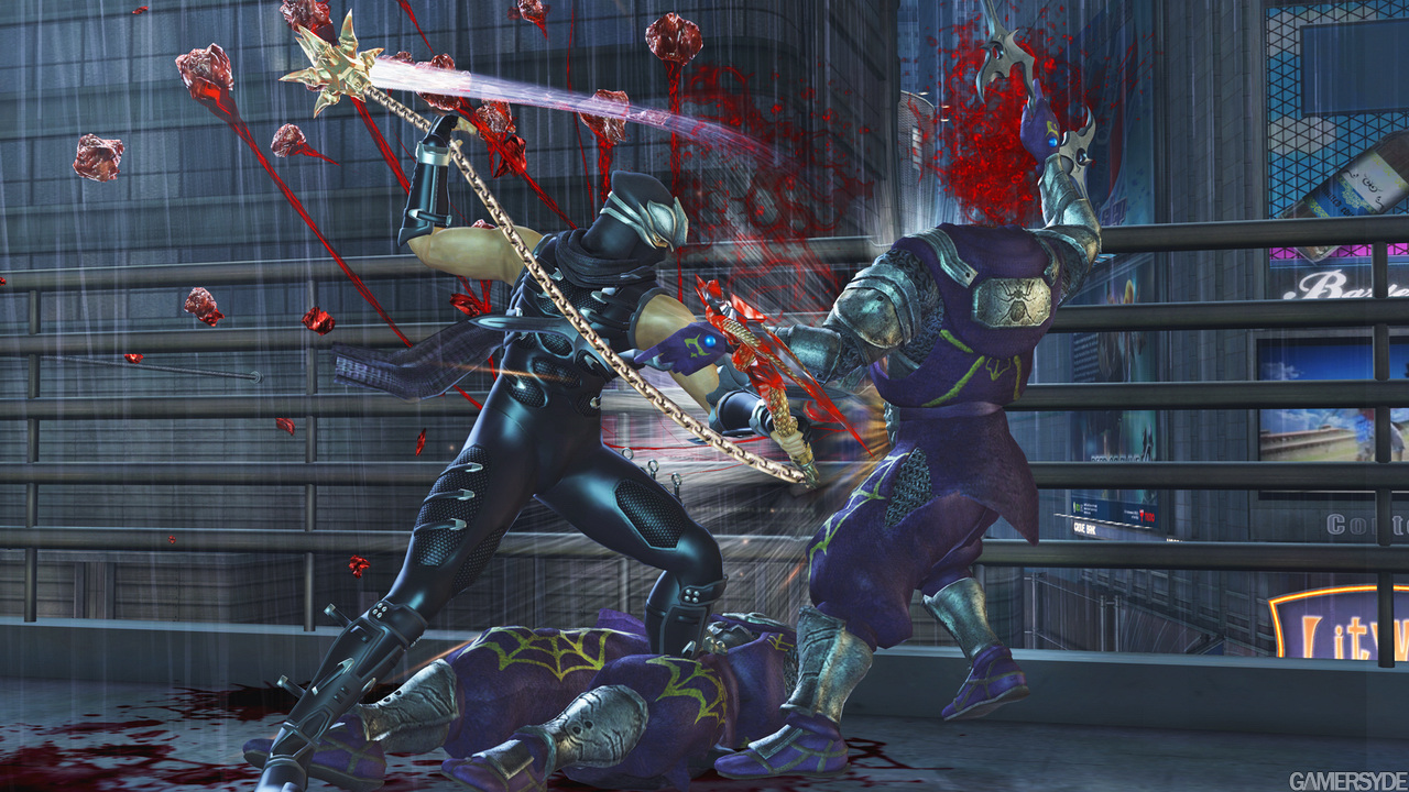
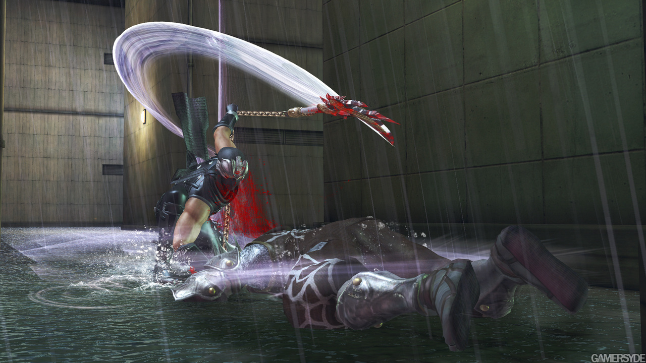
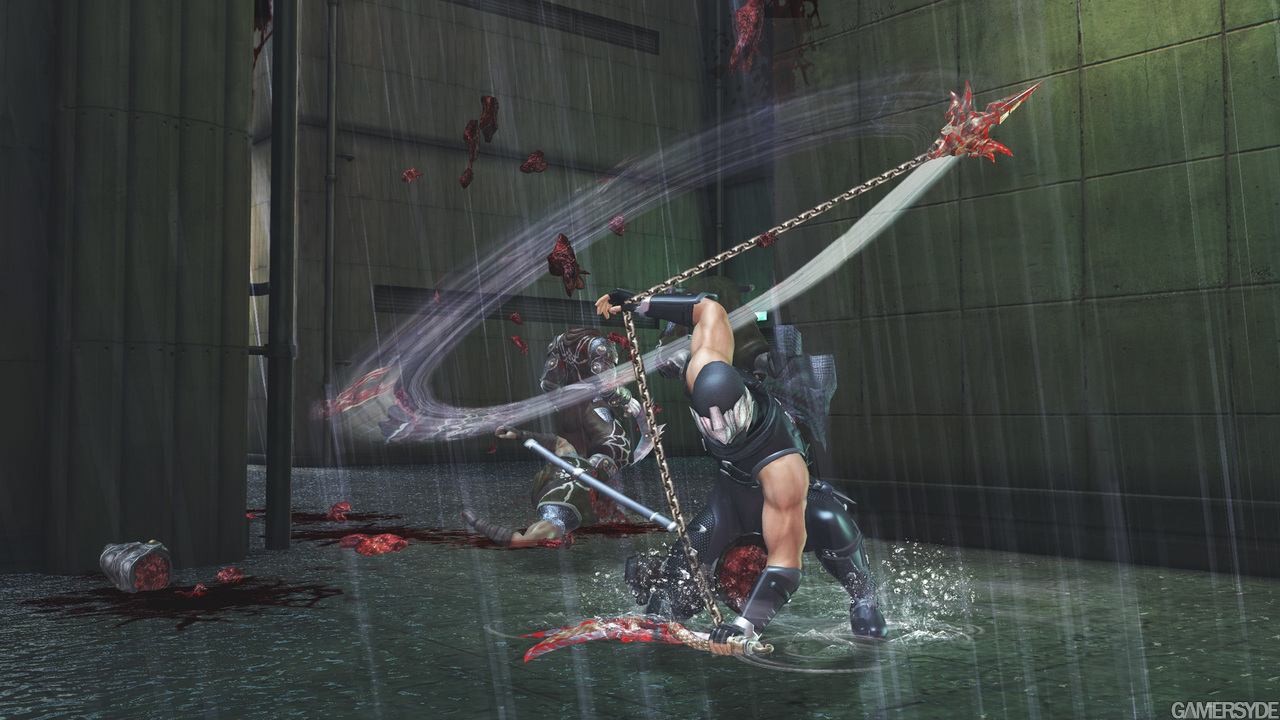
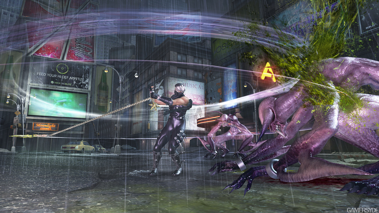
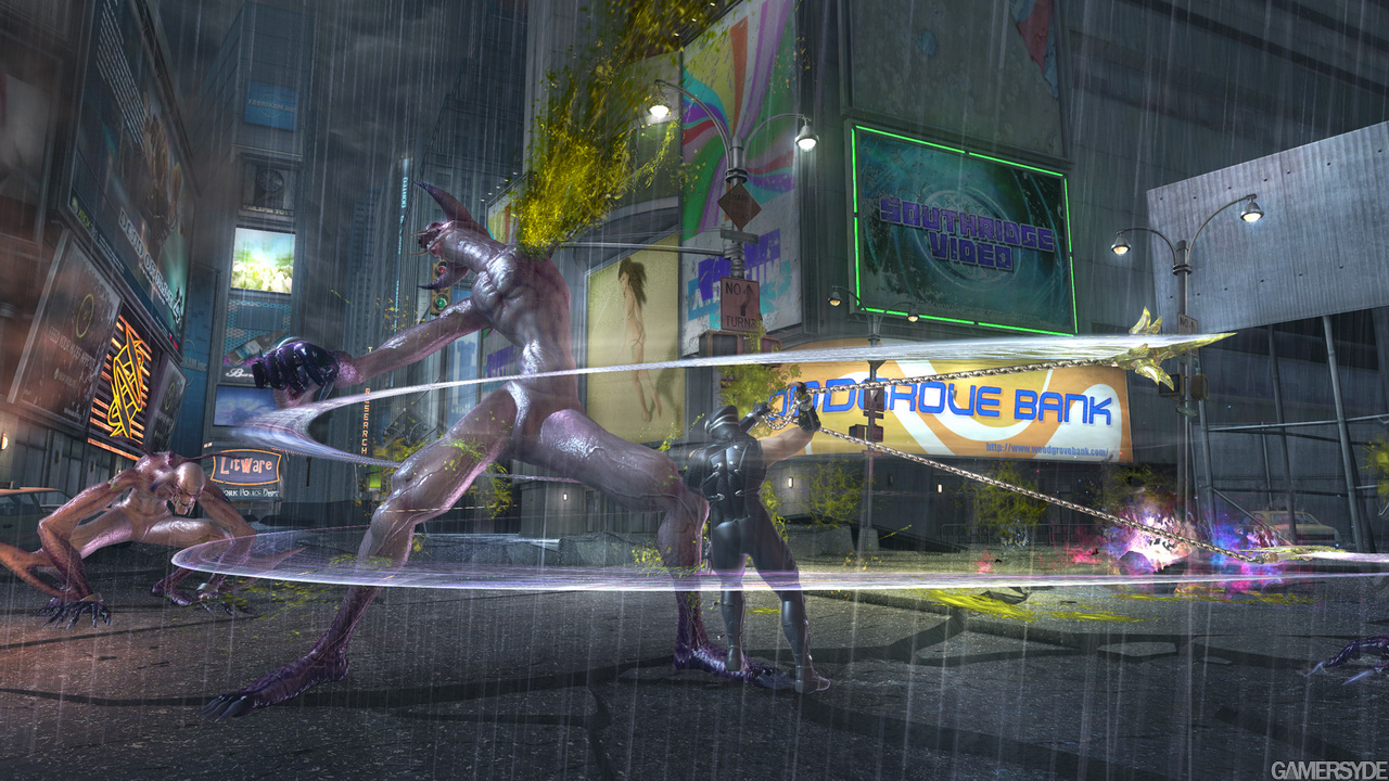
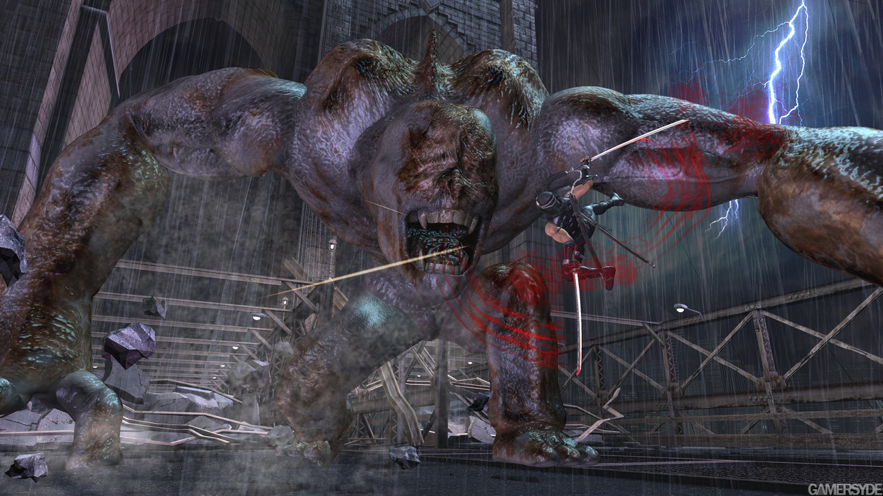
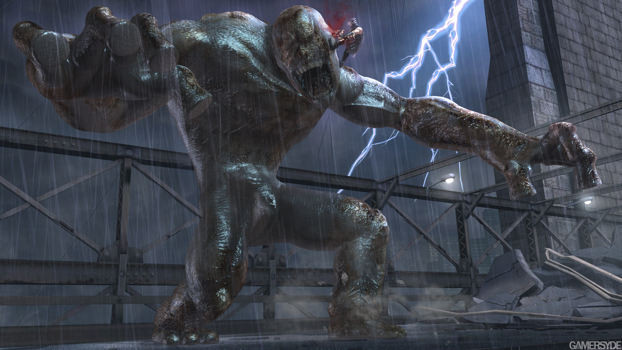
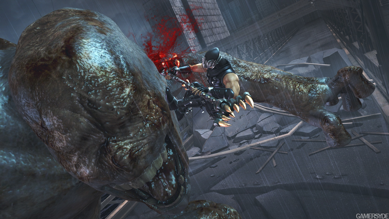
Update: First images of the New-York level added.
I'd like to see your tits my dear! LOL. She looks almost exactly like Rachel. I agree, her render is indeed uninspired, just like the most of NG character design(except ryu). But Story and Art aren't that important to NG anyway, It's all about the action. From the gameplay footage I've seen this will be my personal GOTY!
Leave it to Team Ninja to make breasts jiggle in an overexaggerated manner. I liked Ryu's female ninja counterpart in Dragon Sword to be honest. Much less exagerrated, more modest, and more realistic.
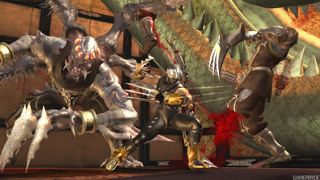
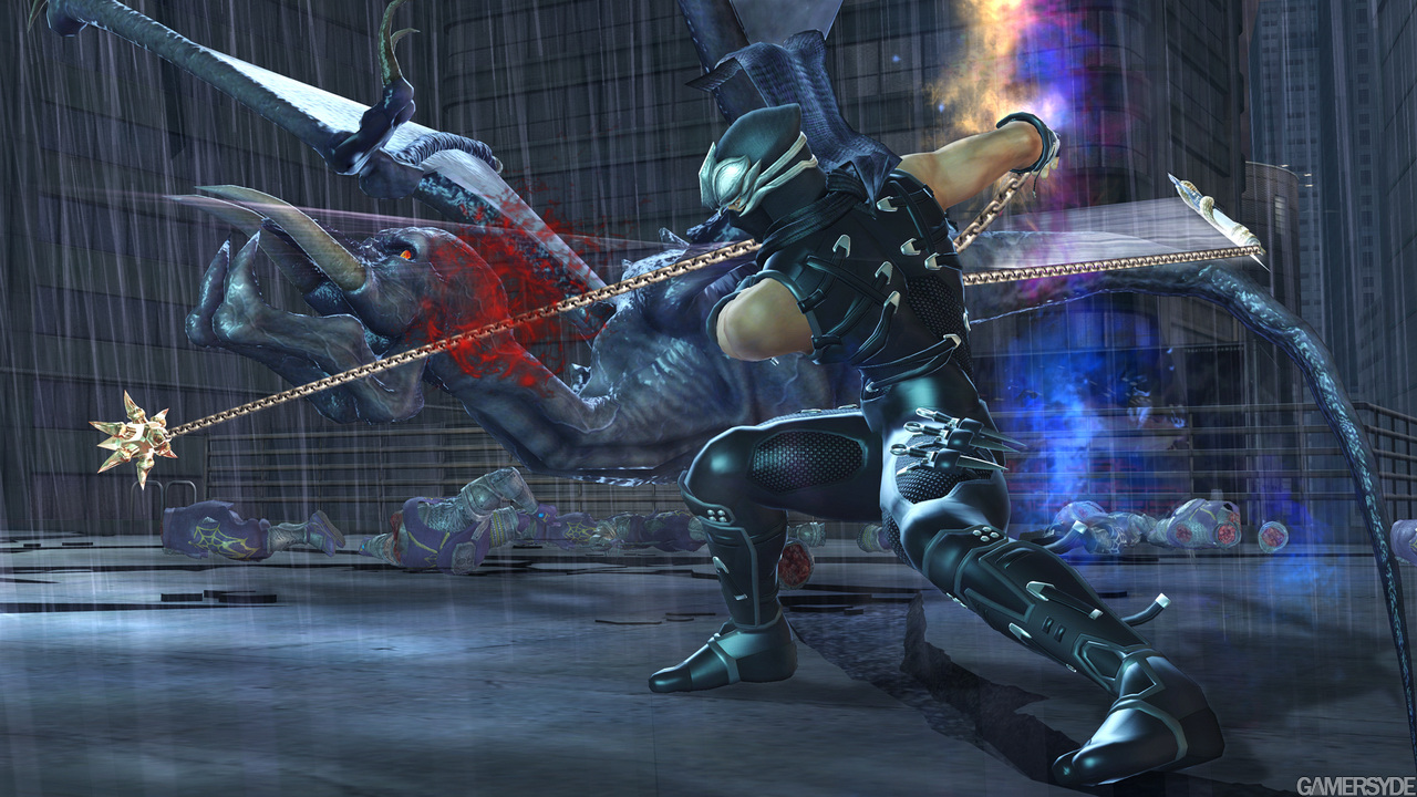
Lighting is truly awfull. The skin looks like cardboard or something. I just can't get over how visually underwhelming this game looks. Such a shame really (yes, graphics do matter).
The gameplay's still tight for sure! One thing I do fear though is that, judging from some previews and early impressions, the adventure aspect of the game will get a serious downgrade this time around. Not too happy with that prospect.
I just can't get over how visually underwhelming this game looks. Such a shame really (yes, graphics do matter).
I thought the graphics were pretty weak after seeing that damn canal level over and over again. After seeing that Temple of Sacrifice video though, my tune has definitely changed. There are aspects that are a tad flat, but the speed and effects and things you won't notice until playing it on a nice hd screen will probably shine through.
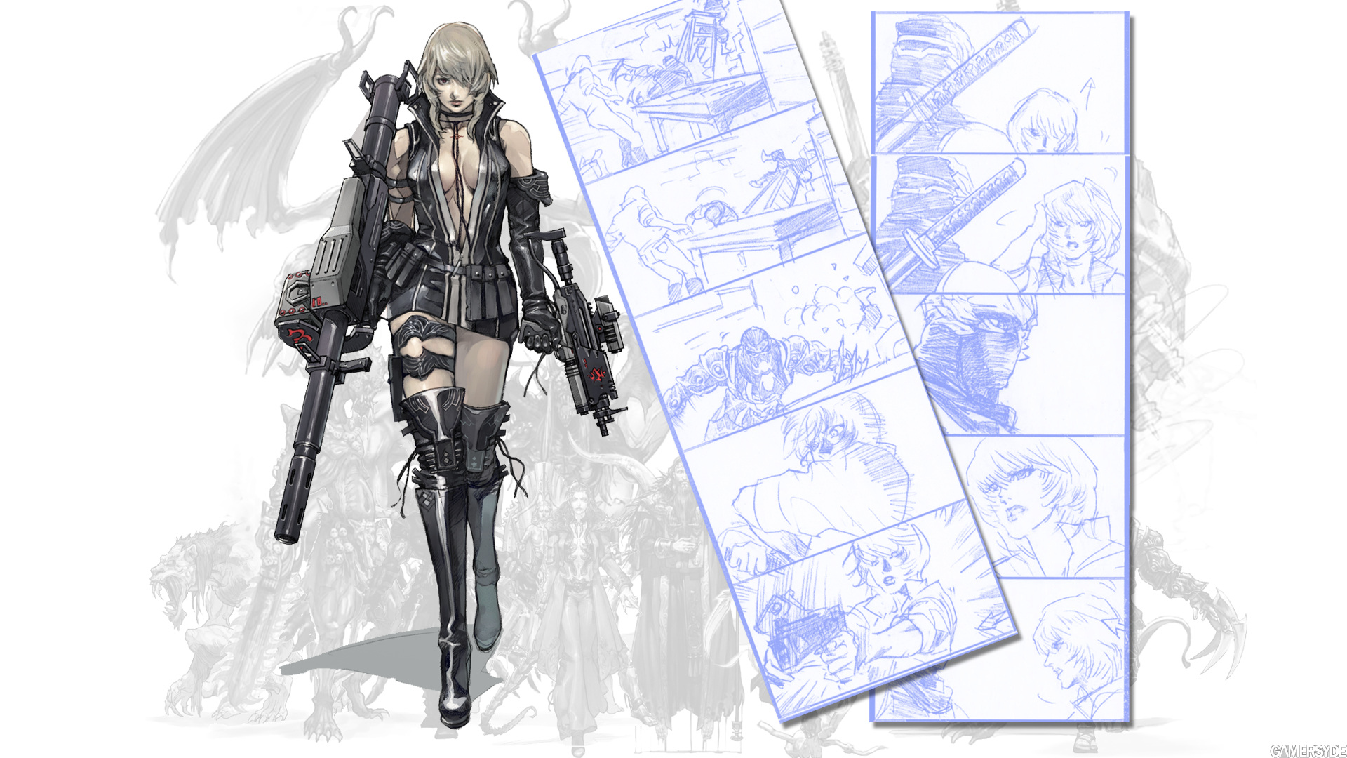
Can someone explain what is so "inspired" about the concept art and not the render? Now, I don't find the render looks particularly good - her face is pretty ugly - but the concept art is pretty much the same except for an anime head and a clichéd big weapon she couldn't conceivably carry in one hand.
I'd like to see your tits my dear! LOL. She looks almost exactly like Rachel. I agree, her render is indeed uninspired, just like the most of NG character design(except ryu). But Story and Art aren't that important to NG anyway, It's all about the action. From the gameplay footage I've seen this will be my personal GOTY!
how strange..i've never seen Team Ninjas concept art, its GREAT, how in the blue fuck do the ingame 3d character models end up looking so bland and generic, for anyone saying the "anime" character design looks worse than the ingame, stop, april fools is over.
Posted by Jato
Lighting is truly awfull. The skin looks like cardboard or something. I just can't get over how visually underwhelming this game looks. Such a shame really (yes, graphics do matter).
i agree, its definitively the promise of solid game play that will sell it, but fanboys will SWEAR those graphics are the greatest EVER!
Commented on 2008-04-07 20:14:54 In reply to pantyhelmet
Posted by pantyhelmet
for anyone saying the "anime" character design looks worse than the ingame, stop, april fools is over.
Nobody said the "anime" character designed looks worse than in game. Not one person. I, however, did say that the concept art is essentially the same as the render except for the anime head...which doesn't seem overly inspired either.
And I can see being disappointed by the graphics from what we've seen so far as I'm sure expectations were sky-high. I still think the game looks fantastic as a whole though.
Commented on 2008-04-07 20:18:00 In reply to Ronsauce
Posted by Ronsauce
I thought the graphics were pretty weak after seeing that damn canal level over and over again. After seeing that Temple of Sacrifice video though, my tune has definitely changed. There are aspects that are a tad flat, but the speed and effects and things you won't notice until playing it on a nice hd screen will probably shine through.
Can someone explain what is so "inspired" about the concept art and not the render? Now, I don't find the render looks particularly good - her face is pretty ugly - but the concept art is pretty much the same except for an anime head and a clichéd big weapon she couldn't conceivably carry in one hand.
for one the shading in the art makes the lighting on the render look like crap, muscle tone , definition/detail is muted in the 3d model due to its vaseline and leather engine..its the level of detail none of Itagaki's games reach because fans are cool with generic DOA 2 level graphic designs covered with layers of expensive effects ..and glitter.
Driftwood
Download is now functional again on Gamersyde. Sorry for the past 53 days or so when it wasn't. (> 3 Months ago)
Driftwood
Another (French) livestream today at 2:30 CEST but you're welcome to drop by and speak English. I will gladly answer in English when I get a chance to catch a breath. :) (> 3 Months ago)
Driftwood
GSY is getting some nice content at 3 pm CEST with our July podcast and some videos of the Deus Ex Mankind Divided preview build. :) (> 3 Months ago)
Driftwood
For once we'll be live at 4:30 pm CEST. Blim should not even be tired! (> 3 Months ago)
Driftwood
More Quantum Break coverage coming in a few hours, 9:00 a.m CEST. (> 3 Months ago)
Driftwood
We'll have a full review up for Firewatch at 7 pm CET. Videos will only be tomorrow though. (> 3 Months ago)
Driftwood
Tonight's livestream will be at 9:15 GMT+1, not GMT+2 as first stated. (> 3 Months ago)


 Patreon


All comments (80)
Commented on 2008-04-07 18:11:47
Commented on 2008-04-07 18:24:19the girl looks out of place.
Commented on 2008-04-07 18:25:56That said, I'm glad it doesn't have the same anime look that the concept art has.
Commented on 2008-04-07 18:26:56
Commented on 2008-04-07 18:27:20 In reply to XSAVAGE
Commented on 2008-04-07 18:28:40
Commented on 2008-04-07 18:30:32
Commented on 2008-04-07 18:30:47
Commented on 2008-04-07 18:31:56
Commented on 2008-04-07 18:36:44
Commented on 2008-04-07 18:45:44
Commented on 2008-04-07 18:49:54
Commented on 2008-04-07 18:49:55
Commented on 2008-04-07 19:00:00Anyway, Ryu against the CIA! Now that sounds like a challenge too me!
Commented on 2008-04-07 19:20:55
Commented on 2008-04-07 19:22:35
Commented on 2008-04-07 19:25:54
Commented on 2008-04-07 19:30:06The gameplay's still tight for sure! One thing I do fear though is that, judging from some previews and early impressions, the adventure aspect of the game will get a serious downgrade this time around. Not too happy with that prospect.
Oh well, we'll see...
Commented on 2008-04-07 19:56:06Can someone explain what is so "inspired" about the concept art and not the render? Now, I don't find the render looks particularly good - her face is pretty ugly - but the concept art is pretty much the same except for an anime head and a clichéd big weapon she couldn't conceivably carry in one hand.
Commented on 2008-04-07 20:03:42 In reply to Jato
Commented on 2008-04-07 20:11:39And drawn by an animation artist by the looks of things...
Western developers take note.
Commented on 2008-04-07 20:12:23
Commented on 2008-04-07 20:14:54 In reply to pantyhelmetAnd I can see being disappointed by the graphics from what we've seen so far as I'm sure expectations were sky-high. I still think the game looks fantastic as a whole though.
Commented on 2008-04-07 20:17:04 In reply to squarejawheroAnd drawn by an animation artist by the looks of things...
Western developers take note.
Commented on 2008-04-07 20:18:00 In reply to RonsauceCan someone explain what is so "inspired" about the concept art and not the render? Now, I don't find the render looks particularly good - her face is pretty ugly - but the concept art is pretty much the same except for an anime head and a clichéd big weapon she couldn't conceivably carry in one hand.