

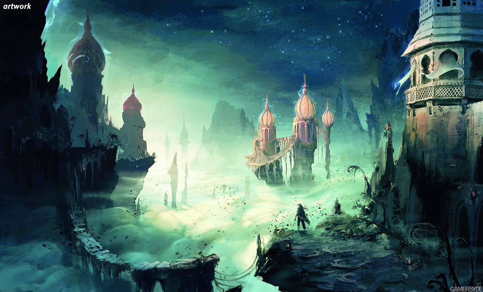
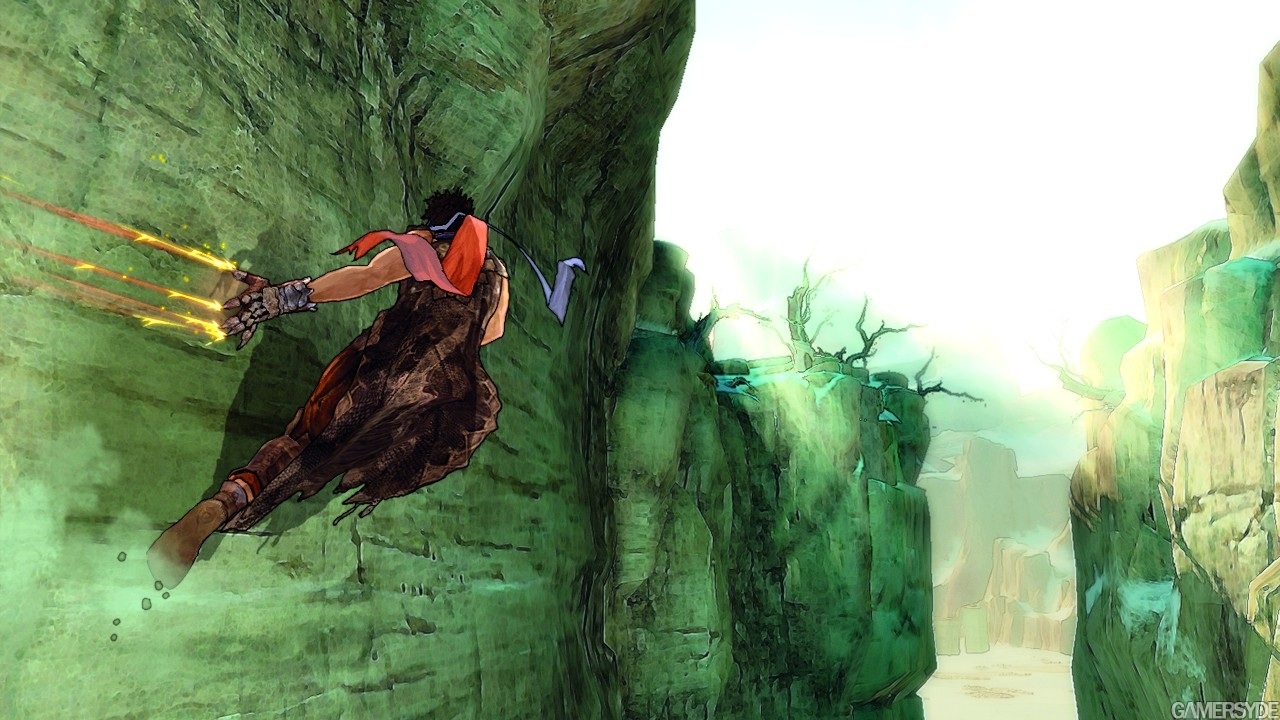
Finally, will say some, Prince of Persia: Prodigy is unveiled through these first screens with an awesome style. Really, it's wonderful, and gives Level 5 a run for its money in the graphical domain. Big surprise for me, knowing this game will be released before the end of the year.

 Patreon


All comments (86)
Commented on 2008-05-22 01:40:45
Commented on 2008-05-22 01:54:05http://images.gamersyde.com/gallery/public/8518/16...
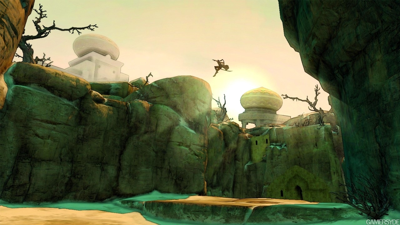
If the whole game looks like you're walking through an artbook(amazing background detail), then I see nothing wrong with this graphical style.
Commented on 2008-05-22 02:05:01I am just a tad worried however because I haven't been a fan of Ubisoft games this generation. I thought Assassin's Creed was shite.
Commented on 2008-05-22 02:05:18
Commented on 2008-05-22 02:08:29
Commented on 2008-05-22 02:13:03
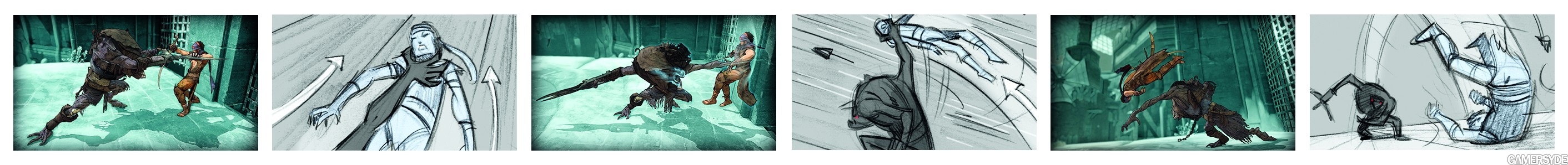
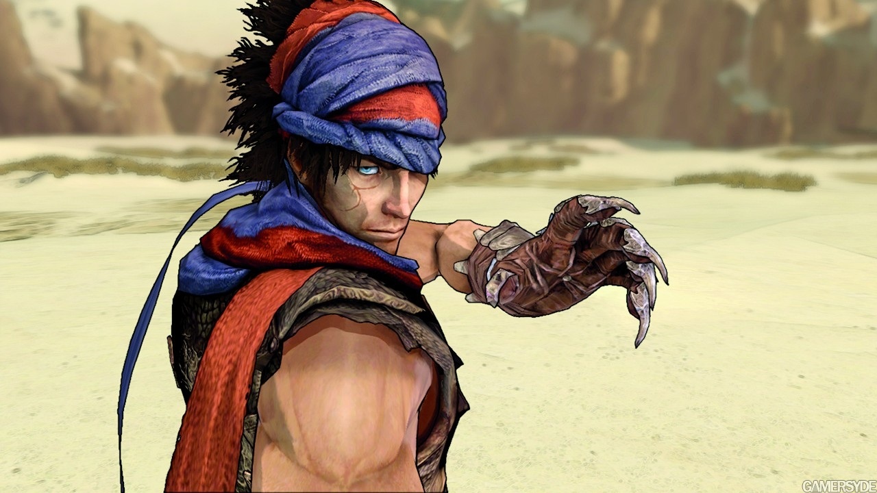
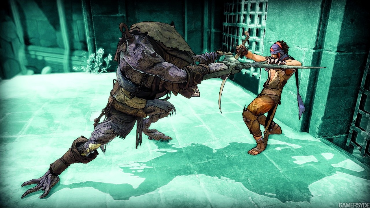
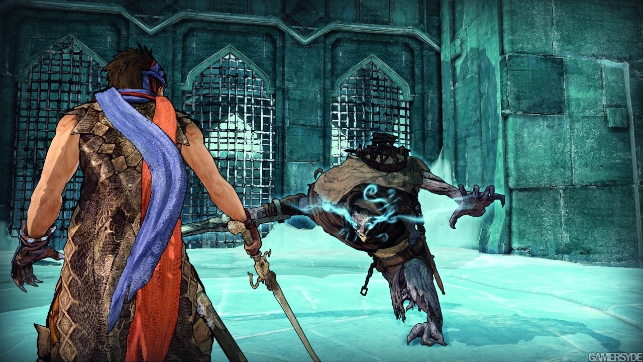
Commented on 2008-05-22 02:14:33 In reply to ContraThis looks to be probably one of my favourite looking games ever. There's plenty of colour, but good taste prevents it from being tacky with its colours; it's cartoony but dark. The detail is pretty sweet as well. Plus, I'm diggin' the design of the Prince and the one monster thing in the screens.
Before we saw any Ninja Gaiden 2 screens/footage, I was either hoping Team Ninja was going to go uber-realistic with its design or go for something like this. NG2 would've been pretty sick looking like this with its insane speed, crazy effects, and geysers of stylized blood.
Commented on 2008-05-22 02:19:37
Commented on 2008-05-22 02:20:01
Commented on 2008-05-22 02:22:15 In reply to 360ownageSome comic strips are nice looking...and by "some" I mean Calvin & Hobbes.
Commented on 2008-05-22 02:24:53
Commented on 2008-05-22 02:34:16
Commented on 2008-05-22 03:00:44
Commented on 2008-05-22 03:01:02
Commented on 2008-05-22 03:02:52 In reply to spydaweb
Commented on 2008-05-22 03:11:48The closeup of... and the... awesomeness... and...
*Dies again*
Commented on 2008-05-22 03:30:26
Commented on 2008-05-22 04:29:50
Commented on 2008-05-22 04:36:44It looks like it was painted with watercolors. Beautiful.
Commented on 2008-05-22 04:39:49I do think that this is going to drastically change the feel of the game. lets just see if they actually spend enough time on character animation or if it ends up all jerky and quick.
Commented on 2008-05-22 04:53:31 In reply to threesixty
Commented on 2008-05-22 04:56:54
Commented on 2008-05-22 05:28:05 In reply to Namaiwa"next gen" should not be cell shaded! that was last gen attempt to make a game look better than the hardware could support and have room to slack on graphics because it really isnt that demanding. a "next gen" game should push the graphical limits and reallity, this is not even close.
it doesnt take a next gen console to play a comic strip. its a glorified comic come to life. the type of detail in this game is like a drawing nothing graphically complex, not going to push the consoles with this one.
imagine if gran turismo prologue was done in cell shading, that wouldnt even be close to what it is now, no one would say that it was a next gen game and no one would praise it.
Commented on 2008-05-22 05:29:08
Commented on 2008-05-22 05:29:59Nice art direction though, heavily inspired by Shadow of the Colossus and Okami adapted for american teens.