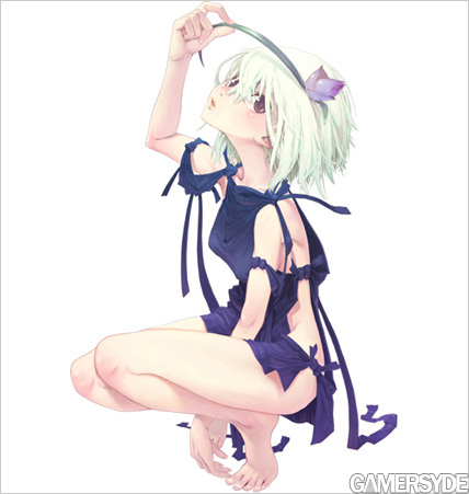
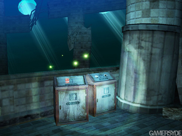
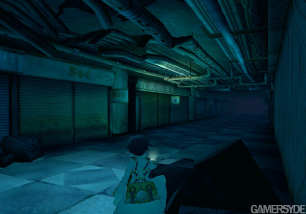
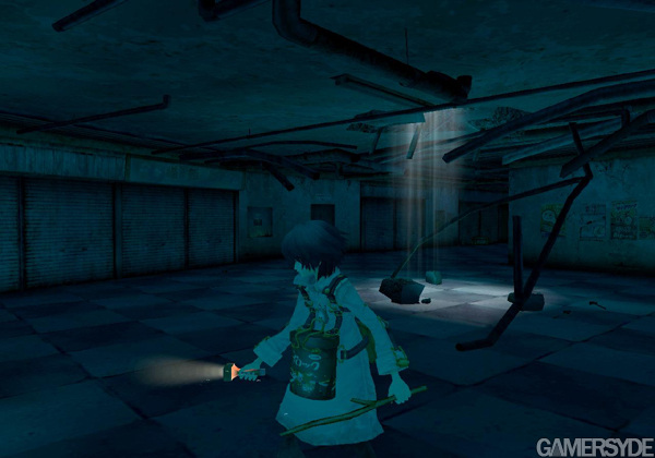
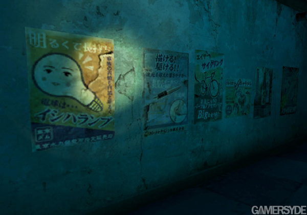
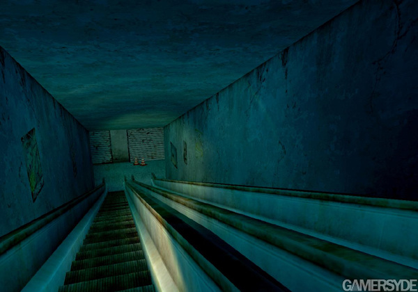
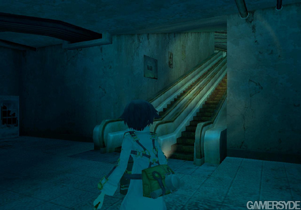
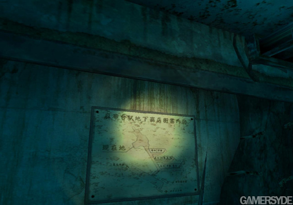
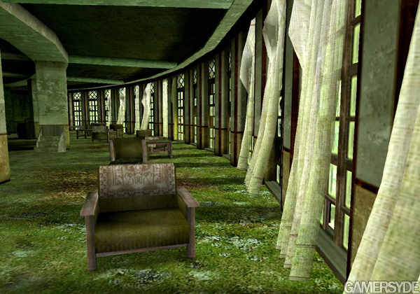
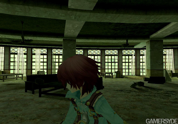
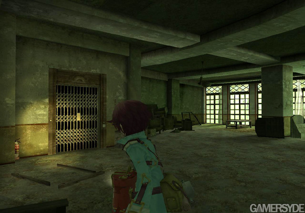
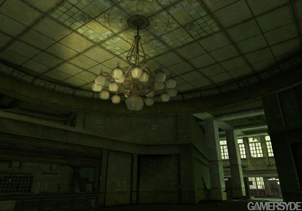
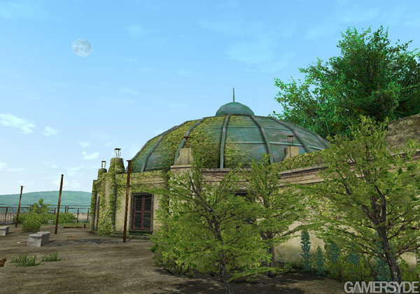
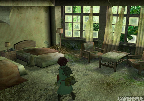
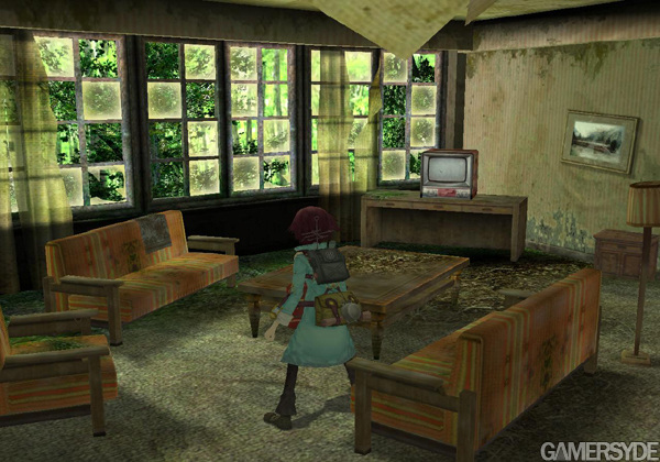
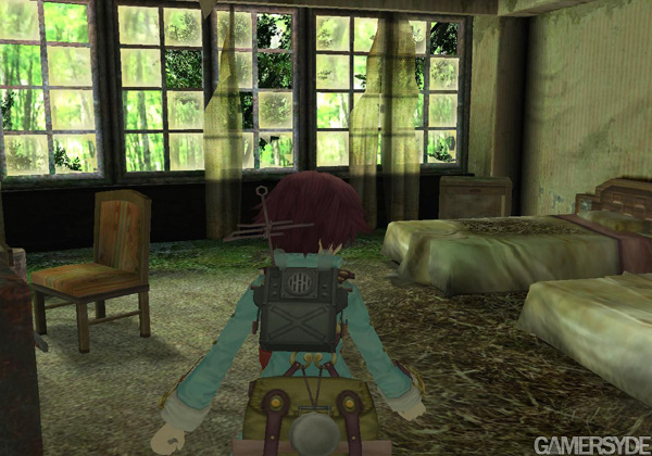
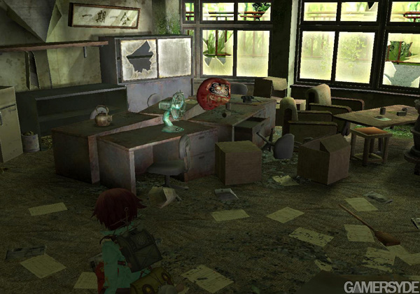
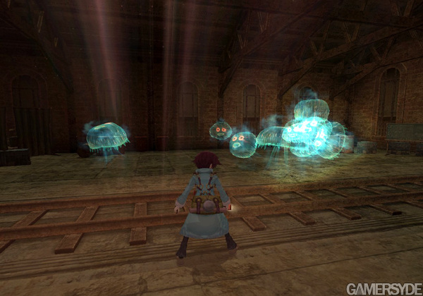
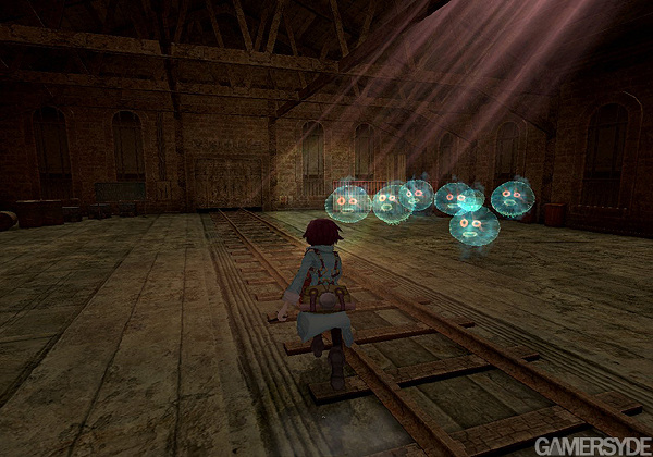
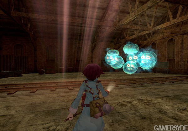
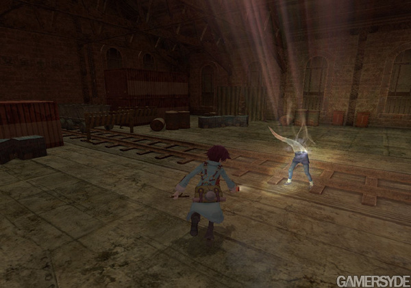
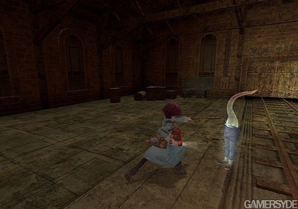
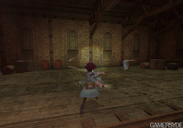
Namco-Bandai continues on its roll and gives us about thirty images of the intriguing Fragile, constituted of artworks and a lot of screenshots. This twilight Zelda-like is planned god-knows-when exclusively on Wii.
Finally a 3rd party putting effort in a Wii game!!! Other Than No More Heroes, I haven't seen any effort on 3rd party's side minus Lost Winds...which is Wii Ware.
I can see an effort by a 3rd party company, not like in other Wii 3rd party games that look horrible and plain. Here I see nice environments, nive work on textures, great art style, etc. Looks great to me too
looks very atmosphaeric, I think Wii owners are in for a treat with this title .. as a PS3 only user I can't help to think about the possibilities this game could have on a console with higher raw power, but simply dissing the game for some blurry textures without looking at the awesome art style is a sin
Driftwood
Download is now functional again on Gamersyde. Sorry for the past 53 days or so when it wasn't. (> 3 Months ago)
Driftwood
Another (French) livestream today at 2:30 CEST but you're welcome to drop by and speak English. I will gladly answer in English when I get a chance to catch a breath. :) (> 3 Months ago)
Driftwood
GSY is getting some nice content at 3 pm CEST with our July podcast and some videos of the Deus Ex Mankind Divided preview build. :) (> 3 Months ago)
Driftwood
For once we'll be live at 4:30 pm CEST. Blim should not even be tired! (> 3 Months ago)
Driftwood
More Quantum Break coverage coming in a few hours, 9:00 a.m CEST. (> 3 Months ago)
Driftwood
We'll have a full review up for Firewatch at 7 pm CET. Videos will only be tomorrow though. (> 3 Months ago)
Driftwood
Tonight's livestream will be at 9:15 GMT+1, not GMT+2 as first stated. (> 3 Months ago)


 Patreon


All comments (15)
Commented on 2008-06-28 02:58:32
Commented on 2008-06-28 03:13:34
Commented on 2008-06-28 08:32:31Edit: Curious if this game is widescreen. All the screenshots are 4:3 format.
Commented on 2008-06-28 09:50:41UGH!
Commented on 2008-06-28 09:59:57
Commented on 2008-06-28 10:15:32 In reply to starfox14nowUGH!
Commented on 2008-06-28 10:50:47 In reply to starfox14nowUGH!
Looks great to me, art style looks awesome too.
Commented on 2008-06-28 10:56:50buy glasses.
Commented on 2008-06-28 12:02:14
Commented on 2008-06-28 12:56:39
Commented on 2008-06-28 15:26:56 In reply to starfox14nowUGH!
Commented on 2008-06-28 18:38:48
Commented on 2008-06-29 23:08:38
Commented on 2008-06-30 01:21:32
Commented on 2008-06-30 19:12:29