

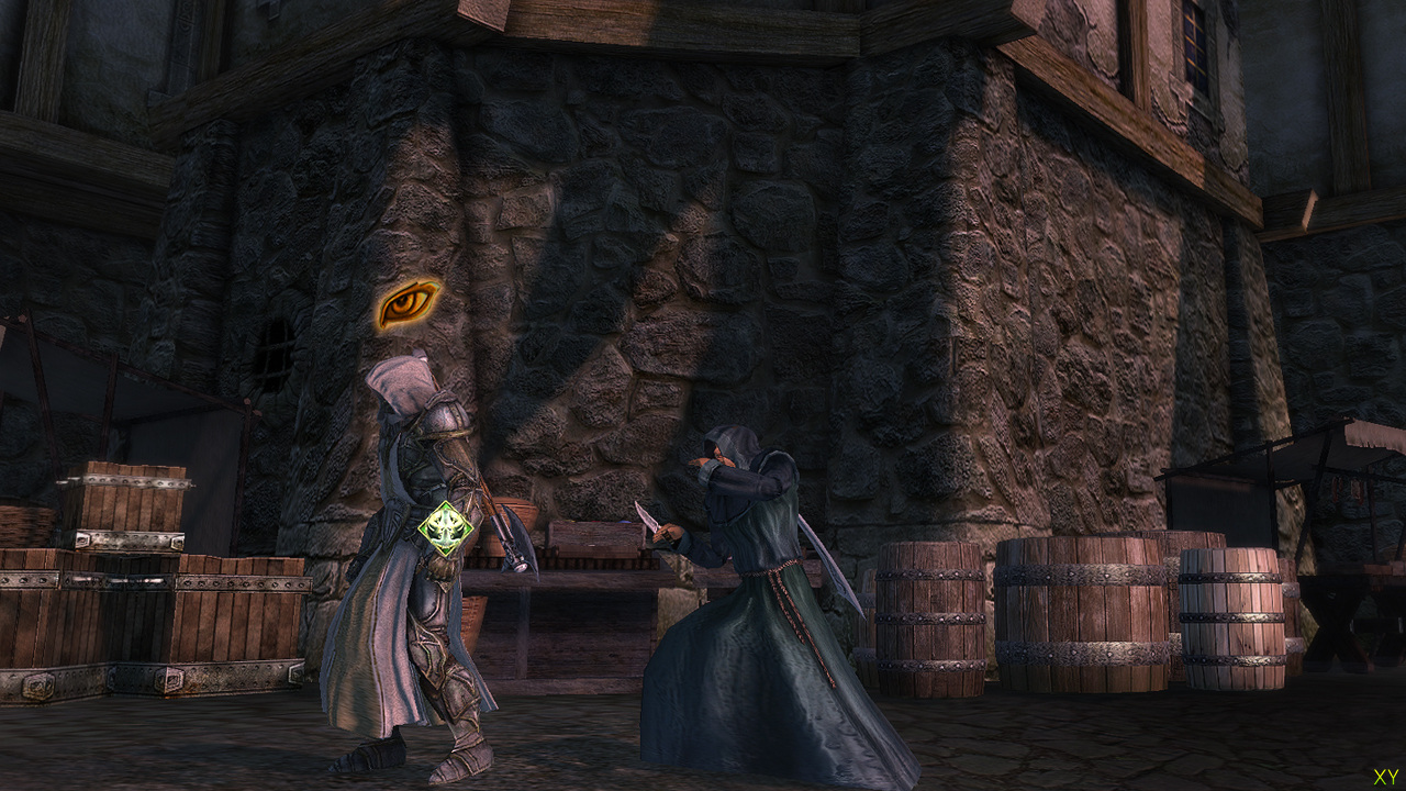
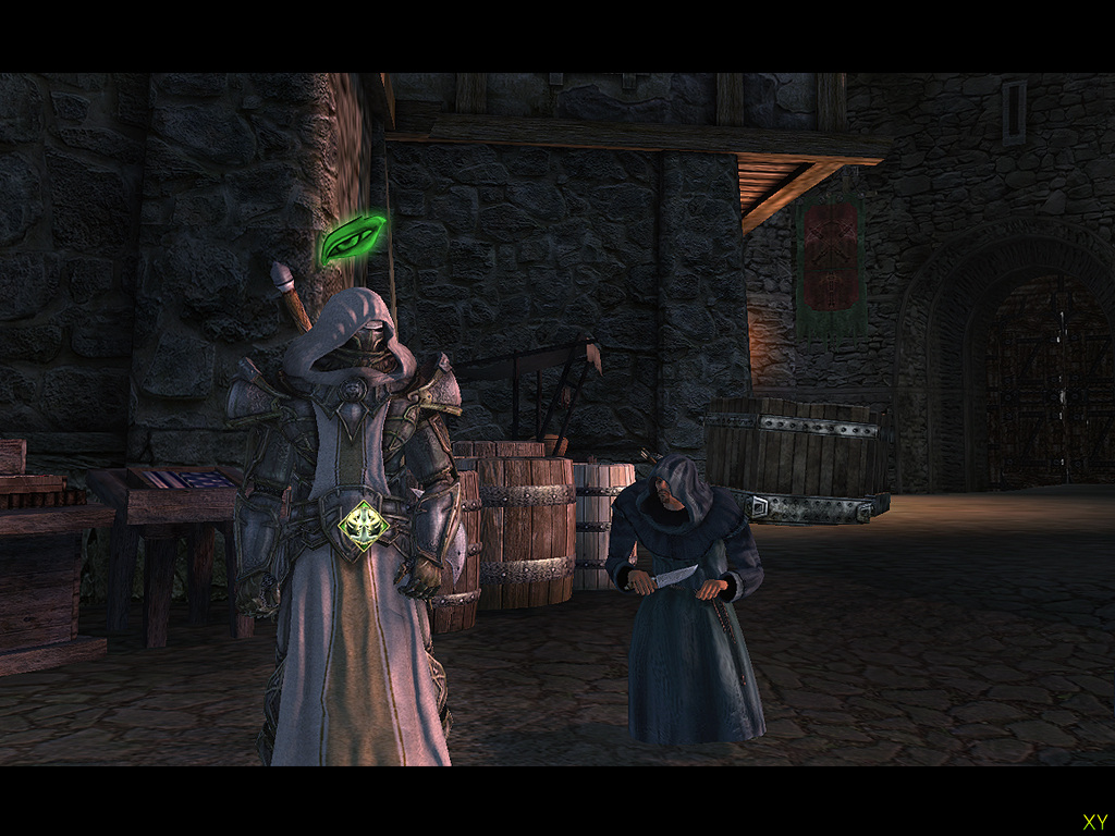
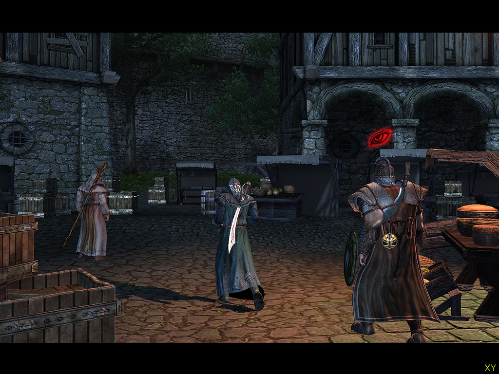
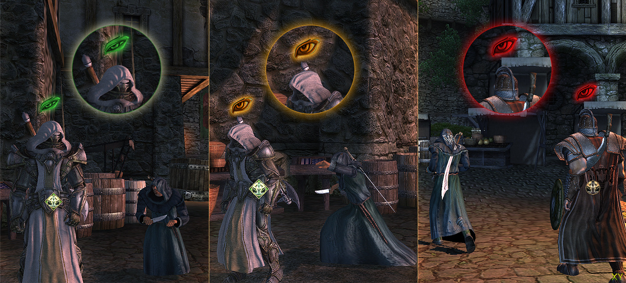
Two Worlds keeps surprising us, this time these new images showing the Sneak mode in action. The eye on top of the target is an indication of the danger of being seen, and of course sneaking because easier as you level up that skill level. Interesting.


 Patreon


All comments (18)
Commented on 2007-03-16 19:16:34
Commented on 2007-03-16 19:17:03
Commented on 2007-03-16 19:18:57
Commented on 2007-03-16 19:27:52
Commented on 2007-03-16 20:02:51
Commented on 2007-03-16 20:03:16 In reply to X_almightyHalo 1 went from distinctly 'meh' gameplay wise, to fucking amazing in the final few months. Pardon my Klingon.
Commented on 2007-03-16 20:25:28
Commented on 2007-03-16 20:30:51Game looks great though, i am a real adveture rpg convert since oblivion, this and elveon are worht keeping an eye on.
Commented on 2007-03-17 00:32:51http://www.xboxyde.com/pop_image.html?G=5083&N=2
They are using a lightmap, or some sort of accumulated lighting, and then multiplying by the colour of the environment (textures)... But the lighting is saturating (hitting the limit of 8bit colour), hence the inner white/yellowy circle of light being cast from the orange light sources. This should just be much brighter orange, not dull white.
It looks utterly terrible to me. Haven't seen this sort of thing since the quake2 days.
They seriously need to reduce the brightness of the lightmap, and bump up the resulting modulation to get some decent contrast in the lighting. It would look worlds better.
This is my quick and very rough attempt to hide the saturation in paint.net:
http://www.hungryspoon.com/random/2w.jpg
If they did it themselves it would look a damn sight better.
Commented on 2007-03-17 02:28:04is this game online like eq2 or world of warcraft,or is it single player
Commented on 2007-03-17 04:09:39The light cast from the lanterns (?) is orange.
So it should be a spherical volume of light... Which is brightest in the very centre (ie, right where the lantern is).
So if you think of it mathematically, at the edges, it should be 0 (no light) and in the centre, it should be a large brightness, eg 5...
So if the colour of the light is orange, that will be an RGB of 1.0, 0.8, 0.2 (or thereabouts).
So at the outside, it's 0,0,0 (they are multiplied), at the inside it should be 5,4,1.. Ie *lots* of red, lots of green, some blue (combines to make orange).
You then multiply it with the surface texture (in this case cobble stones) to get the output. The cobble stones are dark grey, so abour 0.3,0.3,0.3. So at the centre of the light the output pixel should be *really* bright, 1.5, 1.2, 0.3.
However, the lighting is being precalculated, and stored in an 8bit/colour format, so values are being clamped (aka saturated) between 0 and 1.
So at the centre of the light you will get 1,1,1. Multiply this with the cobble stone texture, you get 0.5,0.5,0.5. So there is a *large* circle of light where the lighting does not change, and has no colour. It's not until nearer the edge of the light that you get into unsaturated values (ie, below 1).
They could fix this in two ways:
Store the lighting information in a higher dynamic range (eg, FP10, int10), or store it *darker*, then scale the final value up.
Thats what I've tried to show in the pic, what it *might* look like... But it's hard to do.
There is no big white circle at least.
(does that make sense?)
At any rate it's a very *basic* graphics mistake to make.
Commented on 2007-03-17 06:59:37
Commented on 2007-03-17 15:56:21
Commented on 2007-03-17 16:36:05 In reply to synceHate the art direction, but love the atmosphere.
Commented on 2007-03-18 00:20:39 In reply to ManThatYouFearCritics of this game aren't accusing it of copying oblivion they just point out the obvious similarities, wich fans of this game somehow choose to ignore and claim that "it's nothing like oblivion" when it obviously is. I just don't get why people get so upset when this is compared to oblivion.
Commented on 2007-03-18 10:19:15
Commented on 2007-03-20 07:26:44
Commented on 2007-03-20 17:17:55